The Responsive Viewport
The missing piece of the responsive design puzzle?
17th September 2012, by Edward Cant.
An evolution of the responsive design concept via on-the-fly viewport modification and media query driven style switching.
Responsive web design is exceedingly popular, with good reason. It makes a lot of sense to adjust an experience to accommodate its environment.
A popular CSS approach is to start with a core design that is progressively enhanced via Media Queries to take advantage of increasing viewport real estate.
This often results in two styling end points: small (mobile) viewports and those that are large enough to be considered full experiences, typically desktop screens.
It would be nice to be able to offer a choice between a core view and a full view on devices like the iPhone, since they are capable of rendering both.
Chris Coyier has expressed his thoughts on the subject, including a potential approach to what he calls ‘Opt-Out Responsive Design’.
I see the ability to respond both to viewport size and user preference as an opportunity to allow further responsive choice.
With this in mind, the system I present in this article was designed to offer a responsive design toggle, it's Opt-In and Opt-Out.
I hope ‘opt-out’ is not the term that becomes the community focus!
In terms of implementation, it would seem reasonable to suggest that if we can modify the viewport, we gain the flexibility we need.
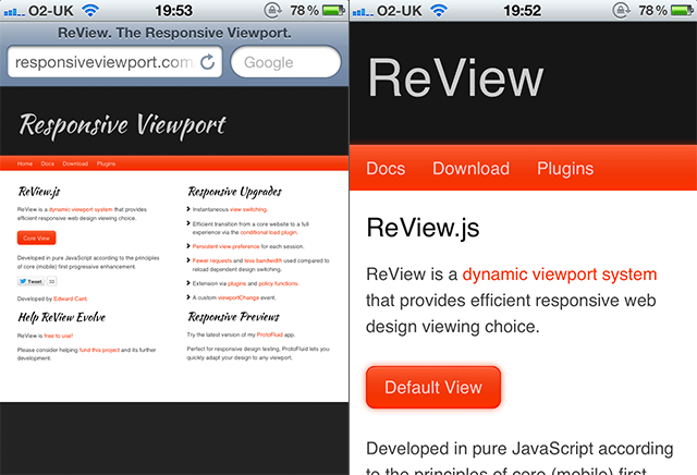
ReView. Leveraging a Dynamic Viewport.
As it turns out, it is possible to dynamically modify the viewport on many popular mobile devices, even after page load.
I've weaponised the idea in ReView, a dynamic viewport system. Demo, documentation and full feature list are available on the website.
ReView is achieved via on-the-fly JavaScript modification of the well supported viewport meta tag.
The viewport meta tag was not intended for use in this manner. Any modification technique has to expect plenty of browser implementation inconsistencies on both mobile and desktop.
ReView attempts to overcome the issues, but is very much an exercise in progressive enhancement. It carefully avoids interfering with user expectations on devices that do not support or require it.
How ReView Works
ReView analyses the initial viewport and meta tag if available.
It then decides the initial view mode,
- Core view (mobile viewport)
- Default view (desktop viewport)
If supported, the system then offers subsequent view changes without reloading the page. More details on the ReView site.
It is possible to apply ReView to a website with no viewport meta tag. This will provide Opt-In responsive design.
Callbacks are provided as well as a viewportChange event, allowing you to further customise the experience.
View preference is automatically stored for the duration of the browsing session via HTML5 sessionStorage.
A plugin mechanism is available to encourge future features, starting with conditional load dependent on view.
Progressive Enhancement
ReView takes a common sense, progressive approach,
- No JavaScript. Normal experience as defined by the developer, responsive or not.
- Mobile device. Core experience defined via meta tag, but with the option to choose the full experience i.e. desktop view.
- Default device. Large viewport or mobile viewport without a meta tag. Automatic full experience.
The core website HTML and content stay the same. Nothing about the responsive design process changes.
If you already have a responsive website, the script enables a view switch mechanism that you previously didn't have.
Further Considerations
ReView allows for more than just view switching.
Consider leveraging the responsive idea not just in terms of visual layout, but also in terms of bandwidth, energy usage and device capabilities.
ReView provides confirmation of either an automatic or user specified full experience and this can be used to trigger further enhancement.
For example, a high pixel density display can be detected and improved assets loaded in accordingly.
Cost Benefits
Benefits to the developer,
- Fewer server requests due to minimised reloads.
- No extra work beyond including a link and the script.
- Increased design freedom since your users now have a choice.
Pages that serve large numbers of requests via mobile websites like google can take advantage of less stress on servers, plus an instantaneous switch for the user which results in a perceived faster website.
Benefits to the user include,
- Previously absent design choice.
- Faster execution of their view preference.
- Less mobile device energy consumed. Radios remain off for a basic view switch.
Comments
I have tested on iPhone (Retina), iPad and a basic Android phone. I do not have the resources to test on many devices, so let me know how you fare.
I suspect that eventually a browser based means to dynamically modify the viewport will be provided. Until then I believe ReView is a neat JavaScript solution.
Comments, suggestions or feedback via Edward Cant on Twitter please.
Follow the author on Twitter.
‘Effortless responsive web design testing’.
Previous Articles
Canvas Generated Icons. Read more.
Targeting Windows 8 Snap Mode. Read more.
CSS @viewport rule or viewport meta tag? Read more.
The Responsive Viewport. Missing piece of the responsive web design puzzle? Read more.
Getting the Viewport Scale.
Read more.
Hiding the iPhone Address Bar.
Read more.
Orientation Correct Screen Width.
Read more.
iPhone Title Modification.
Read more.
Optimising for High Pixel Density Displays.
Read more.
CSS3 Media Query Prototyping With ProtoFluid.
Read more.
AJAX Kill Switch. Version 2.
Read more.
URI Processing With JavaScript.
Read more.
Source Code
All source code is provided for free.
A standard disclaimer of warranty and limitation of liability applies.