CSS3 Media Query Prototyping
‘A media query consists of a media type and zero or more expressions involving media features’
–– W3C CSS3 Media Query specification.
They allow us to specify CSS that is specific to the attributes of the device/browser upon which our content is rendered.
This means that we can present content with style that is appropriate to the rendering capabilities and size of the device in question. This can be a time consuming process.
In this article CSS3 Media Queries are leveraged to quickly and easily prototype CSS for web-enabled devices of varying viewport dimensions.
Presenting…

The Current Approach
A common technique when targeting web-enabled mobile devices is to separate CSS dependent on the ‘device-width’ Media Query.
This works really well, but it is hard to preview the resulting ‘look’ unless you are lucky enough to have a large number of mobile devices to hand for this purpose.
The Solution?
We can supplement or replace the current approach with the ‘width’ Media Query. This enables style switching based on the viewport width.
We can now preview the results of a width-dependent style by simply changing the size of the browser viewport.
For the final website the choice can be made to switch to device based media queries or leave the styling based on viewport dimensions.
Examples
The iPhone screen measures in at 320 by 480px. The ‘max-device-width’ is 480px. The following CSS Media Query covers this for both devices and viewport width based prototyping.
Method 1. Specify the Media Query dependent CSS to load in the HTML.
<link href='css/480.css' media='only screen and (max-width: 480px)' rel='stylesheet' type='text/css'>
Method 2. Specify the Media Queries directly in the CSS itself.
@media only screen and (max-width: 480px) { }
Prototyping with ProtoFluid
Changing the size of the browser window works well. However, we can do better. ProtoFluid allows us to create a viewport with the exact dimensions required.
For example, we can create an iPhone sized viewport. The aforementioned iPhone targeted ‘max-width: 480px’ Media Query will match. CSS developed for the iPhone can now be easily tested as changes are made.
Familiar Tools
ProtoFluid is a web-based prototyping app. This means you can use all the tools you are used to. We use Firebug a lot, so it's nice to stick with it when developing our web applications.
ProtoFluid is a single JavaScript include, so you can prototype on a local server. If you have an Apache server (and associated installs) on your development machine then you are set.
Orientation Tips
More and more devices are supporting the ‘orientation’ CSS Media Query. This allows for styling targeted at the orientation (portrait or landscape) of the viewing device.
ProtoFluid facilitates orientation-based prototyping in browsers that support this feature. The latest versions of FireFox, Safari and Chrome all do.
To enable orientation-based styling, the following Media Queries are needed,
@media all and (orientation: portrait) { ... }
@media all and (orientation: landscape) { ... }
However, a better approach is to assume one as the default (e.g. portrait) and then use a Media Query to modify the style of the other.
Be aware that the ‘orientation’ Media Query is not supported on iPhone yet (Update, supported in iOS4). It is supported on the iPad as well (neat article here).
Further media query options are covered in detail by the W3C CSS3 Media Query specification document.
Those are the basics. Kickstart your mobile development with ProtoFluid today. It includes a free trial and unlimited use is very well priced.
Comments
Comments, suggestions or feedback via Twitter please.
Follow the author on Twitter.
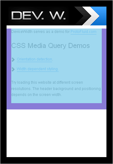
‘Effortless responsive web design testing’.
Previous Articles
Canvas Generated Icons. Read more.
Targeting Windows 8 Snap Mode. Read more.
CSS @viewport rule or viewport meta tag? Read more.
The Responsive Viewport. Missing piece of the responsive web design puzzle? Read more.
Getting the Viewport Scale.
Read more.
Hiding the iPhone Address Bar.
Read more.
Orientation Correct Screen Width.
Read more.
iPhone Title Modification.
Read more.
Optimising for High Pixel Density Displays.
Read more.
CSS3 Media Query Prototyping With ProtoFluid.
Read more.
AJAX Kill Switch. Version 2.
Read more.
URI Processing With JavaScript.
Read more.
Source Code
All source code is provided for free.
A standard disclaimer of warranty and limitation of liability applies.